
Todoist is used by millions of people every day to manage everything from daily tasks to long-term goals. Designing for a such a beloved product requires balancing innovation and consistency. Updates need to feel familiar, work effortlessly across platforms, and add real value without messing with people’s workflows.
Over the past three years at Doist, I’ve worked on a wide range of features and improvements across the product. The examples below highlight some of the work I’m most proud of: Making everyday workflows smoother, and playing a part in how Todoist continues to grow and adapt to people’s needs.
I designed the templates feature to help people kickstart their projects faster and work more efficiently, whether as individuals or with a team. You can now save entire project setups, individual tasks, or workflows as reusable templates.
People can keep them private, share them with collaborators, or browse curated templates created by the Todoist team. I led this feature from first prototype to full rollout, building it from the ground up to support smoother collaboration and save people time every day.
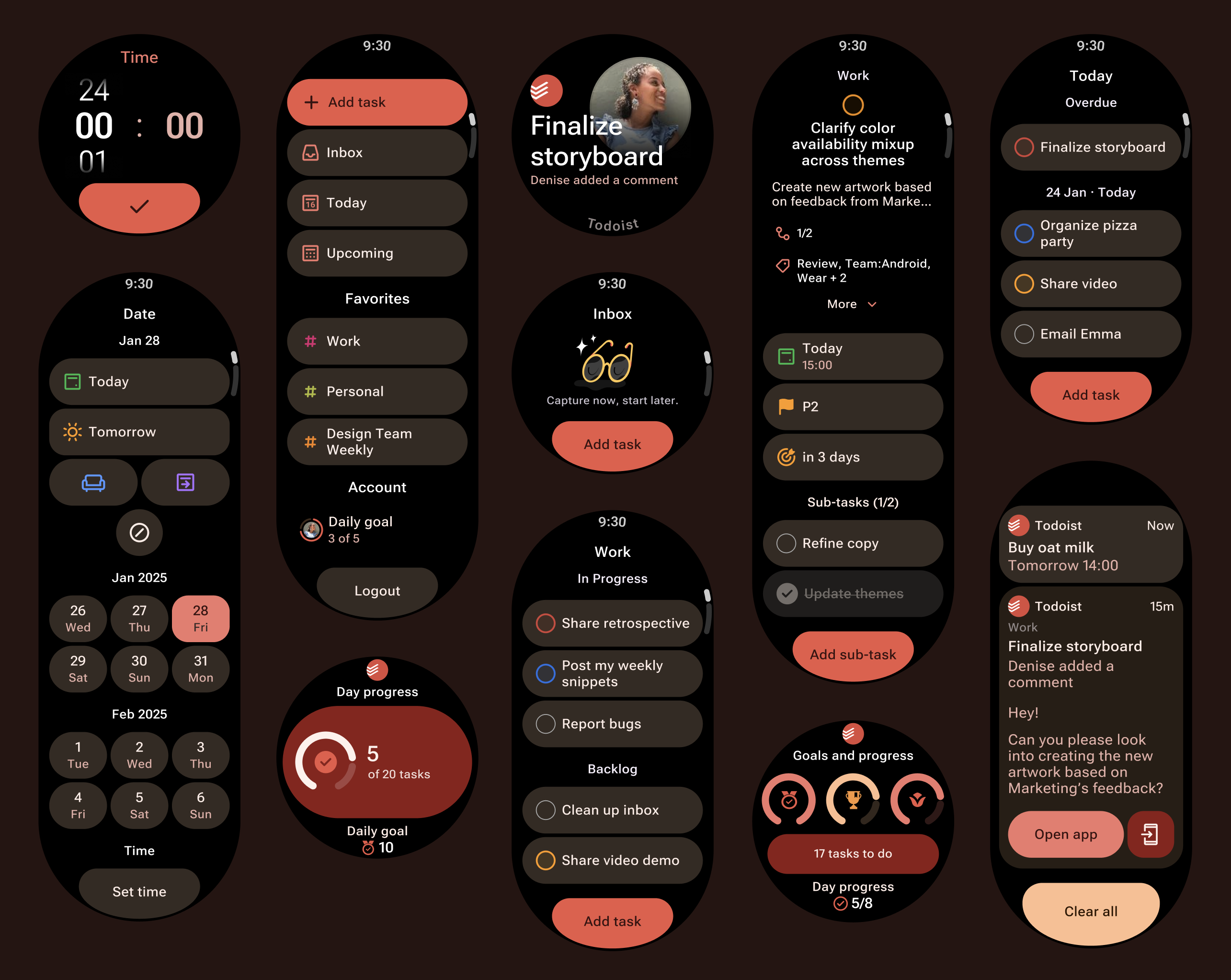
Redesigning Todoist’s Wear OS app for Material 3 Expressive was an exciting opportunity to bring the app’s core functionality to an even smaller screen. With Todoist being available on mobile, desktop, web and smartwatches, designing means thinking truly cross-platform. The challenge was to balance platform guidelines with Todoist’s design language, all while working within the extreme constraints of a watch interface. Every decision had to be intentional, with ruthless prioritization and thoughtful trade-offs to make the core experience feel just as effortless as on much more spacious devices.
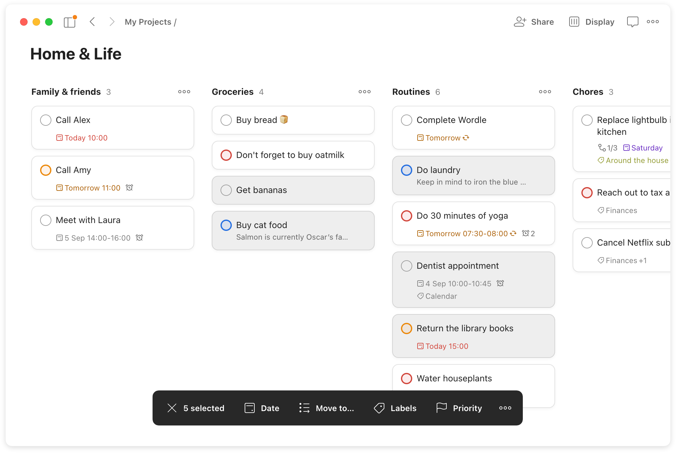
A high-impact feature for heavy users that enables people to bulk update their to-do’s, helping them to re-organize tasks effortlessly.
I’ve lead several accessibility initiatives ranging from color contrast improvements, exploring priority differentiation without relying on color and designing with neurodiversity in mind.
I led key improvements to the design system that powers Todoist, starting with tokenizing colors and text styles to create a more flexible and scalable foundation. This included spearheading the initiative to automatically sync color tokens for nine themes across all platforms.
I also maintained and expanded our component libraries, and introduced clear checklists and workflows to make contributing easy and accessible for the whole team. Over time, I became the go-to person for everything related to components, tokens, and design variables.


